Color Palettes
Greens and reds and blues - oh my! How do I pick my event colors when there are so many beauties to choose from?!
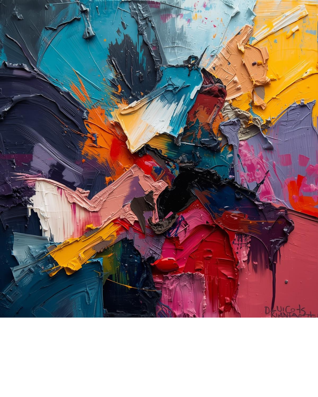
Find your colors:
Do you have a favorite color you want to focus on? Are you getting married at a time of the year that highlights certain hues? Do you have a favorite flower or linen that you want to spotlight as a centerpiece of your color palette? Do you envision eye catching pops of vibrant color or a gentle flow to the event space? These are all great places to start when you are looking at colors.
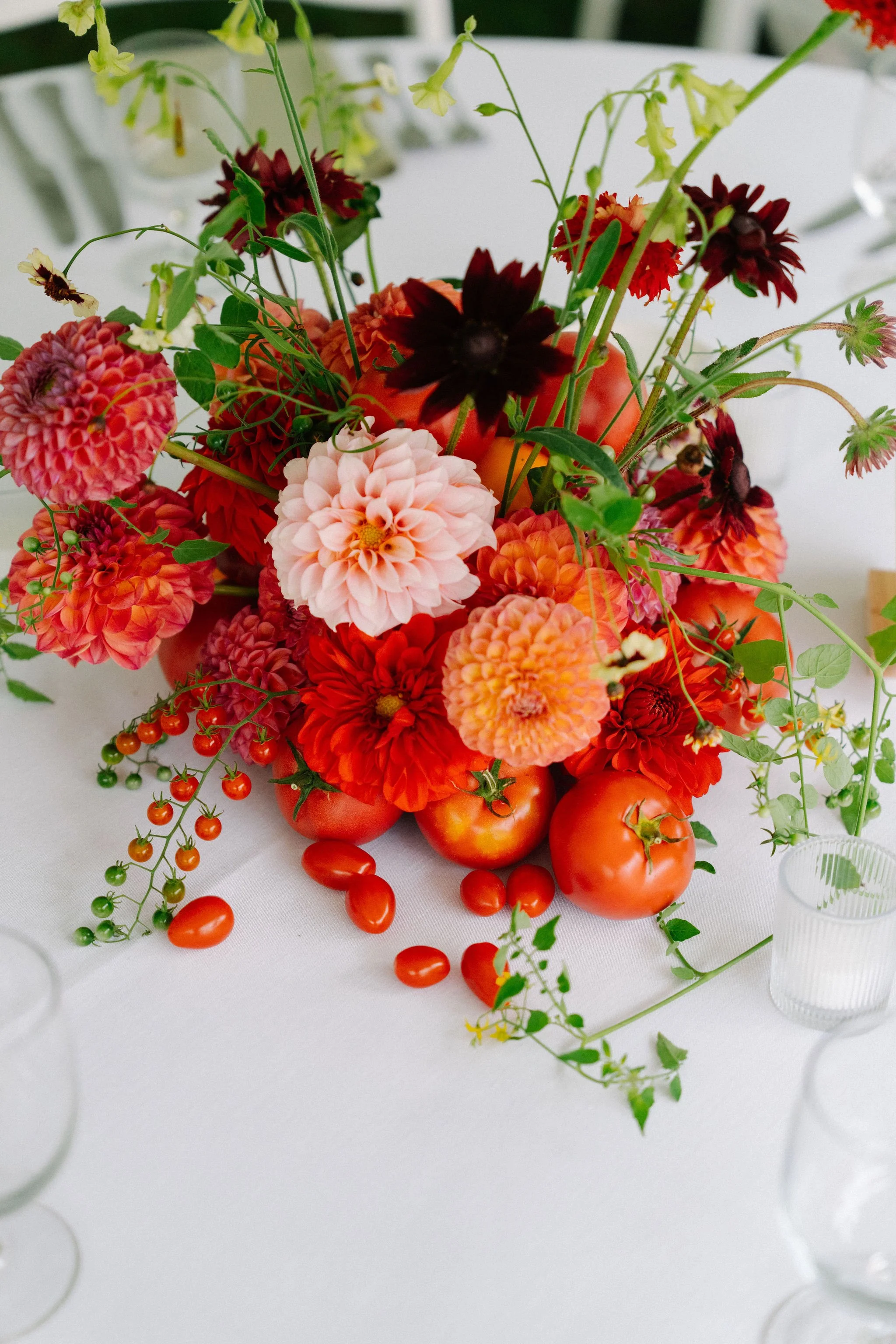
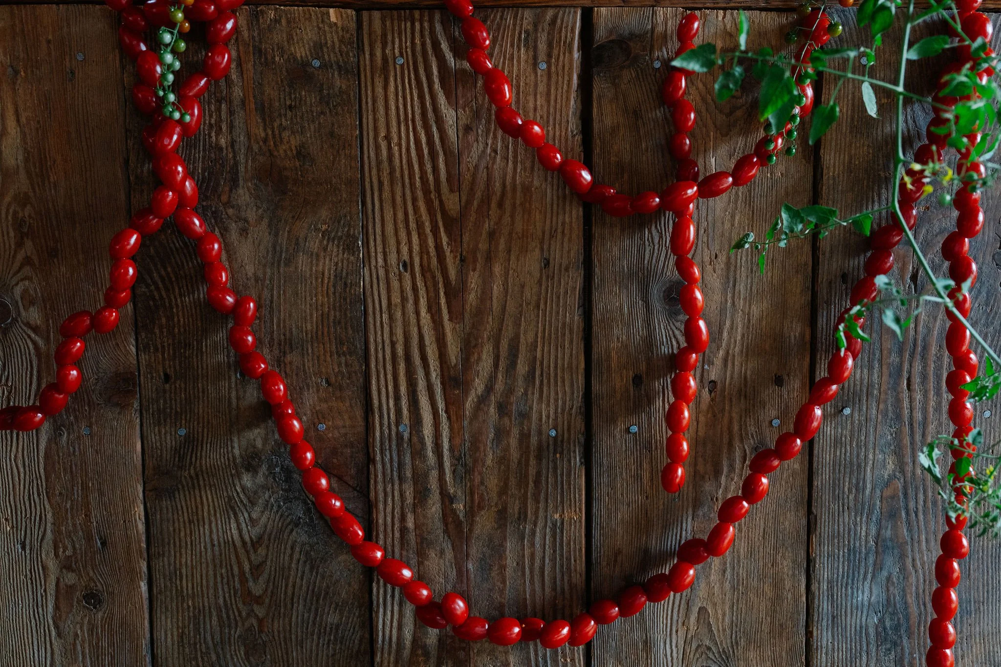
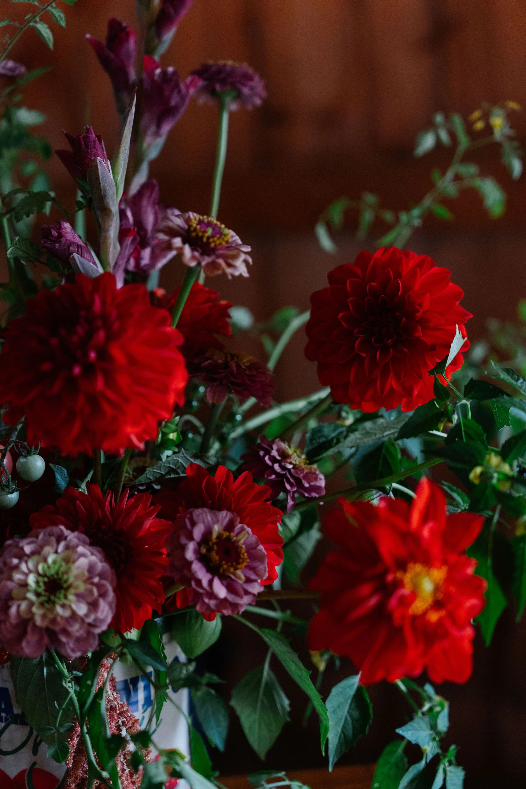
Food items have also become a fun way to add color, texture, and interest to table decor. In recent years, we’ve seen lemons, oranges, blood oranges, nectarines, limes, and many other fruits incorporated into floral arrangements. One of our couples took this inspiration while leaning into their shared heritage to host their wedding as an Italian Garden Party. Their design centered around red and tomatoes were a natural center piece of their tablescape, while also tying into their menu.
Palette Ideas:
Timeless combinations: Black and white. Add pops of another color - blush, gold, champagne, or a more vivid green like our bride below - for a fun update to the classic.
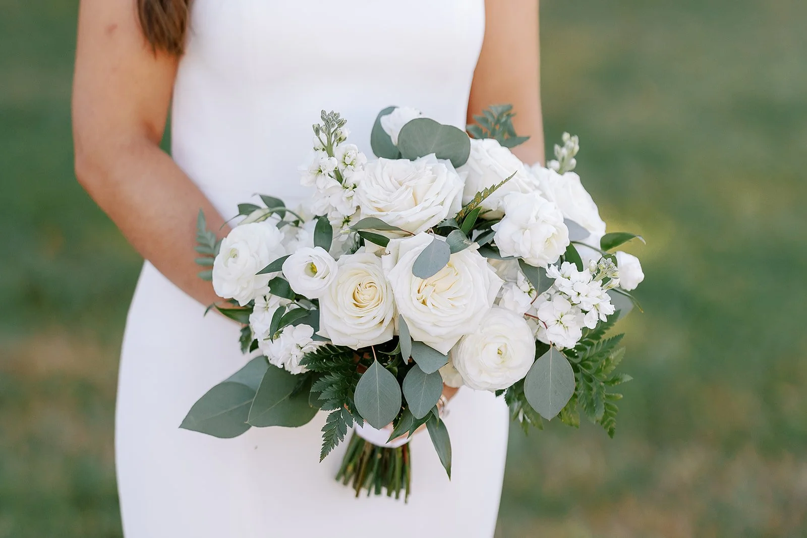
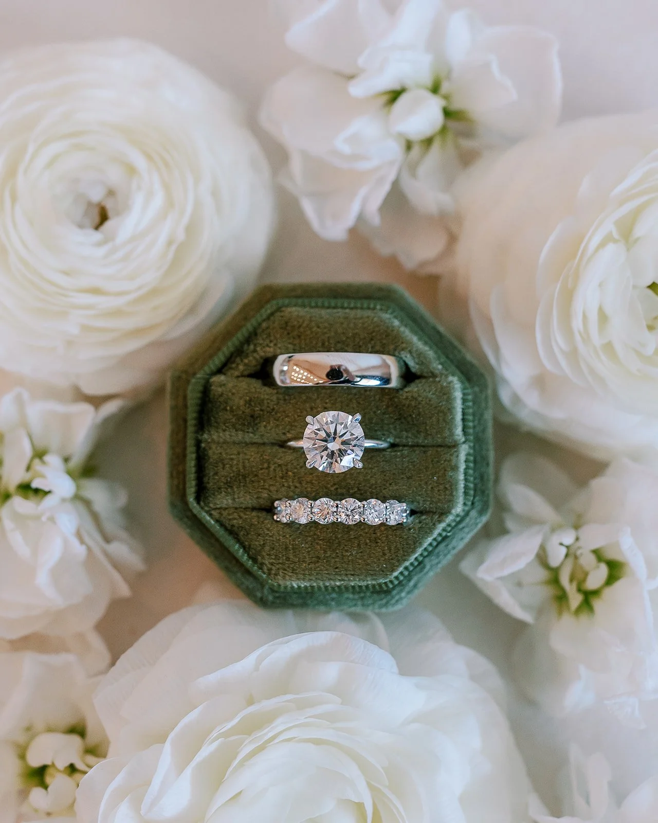
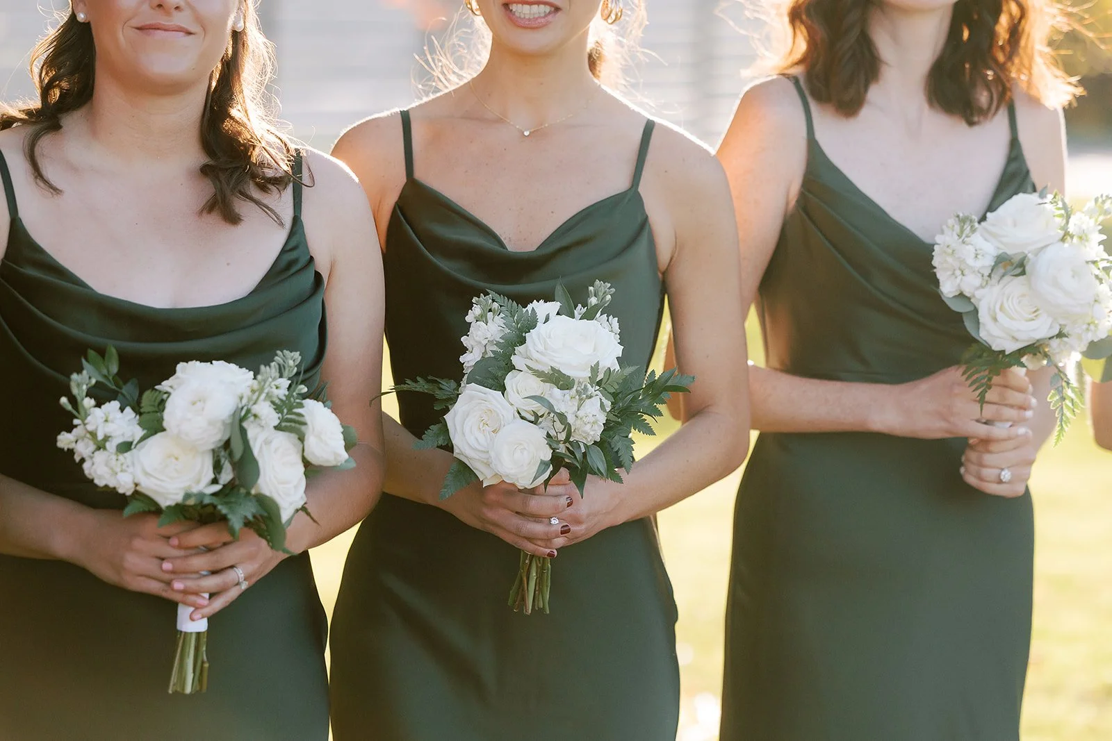
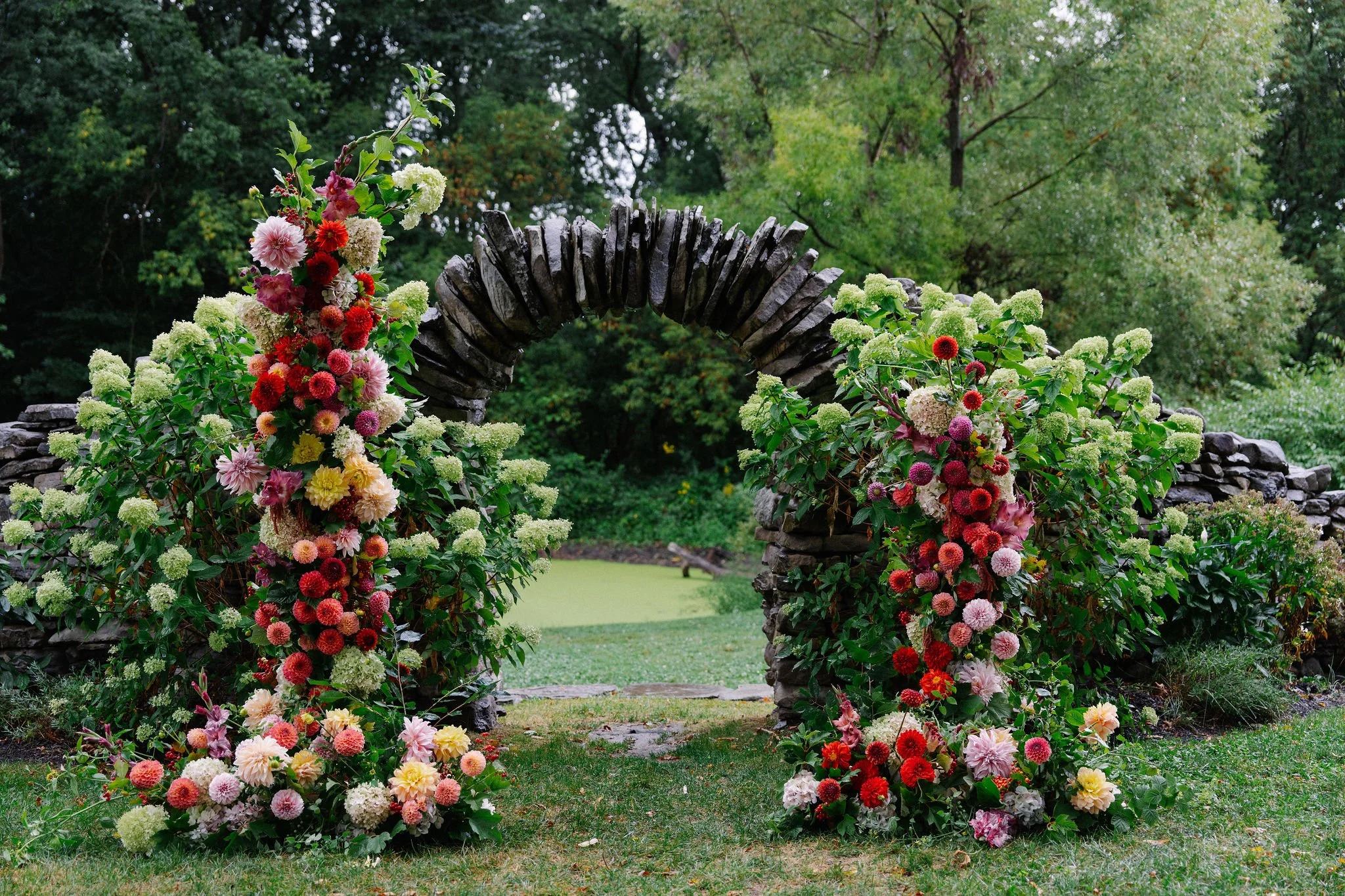
Seasonal favorites: For spring and summer, we love embracing shades of green to celebrate the lush floral and vegetative life that happens during these seasons. In fall, shades of oranges and burgundies really pop, similar to changing leaves on trees, at a time of the year when things can start to feel a little dull (cue Noah Kahan’s “Stick Season”). And winter weddings can be a great time to use a dark and moody, or a rich color palette, to play off the white, snow covered hills.
Embrace the Color: In recent years, we’ve seen couples embrace color. Jewel tones, festive garden parties, and explosions of bold color choices have made for a beautiful background to these celebrations. Bold and colorful florals are a great way to celebrate colors and textures, and wildflowers can add a fun pop of seasonal fun. Rental furniture and linens in bold color statements provide larger additions of color, as well as the functionality of places for guests to sit and rest.
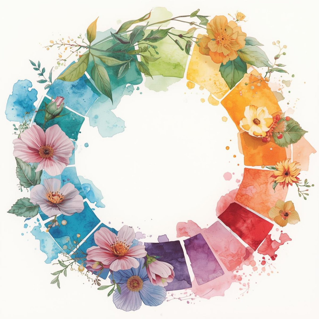
The color wheel can also be incredibly helpful, if you are at an impasse. First, find your main color.
Harmony: Colors directly on either side of it are analogous or harmonious, creating serene and cohesive looks. You can use different tints, tones, and shades of these colors to achieve a color combination that’s right for you. Meaning, if you really like green, harmonious colors would be yellow tones and blue tones, but you can personalize it even more by using a lighter or darker shades - like sage green, ash blue, and a dark cream.
Complementary: Colors directly across from one another on the color wheel are complementary. The main colors are the primary colors and their compliment: red/green, yellow/purple, and blue/orange. When side-by-side, the strong contrast between complementary colors create a vibrancy and visual pop. When mixed into each other, they will also neutralize each other out (that is why purple shampoo is especially helpful in preventing blonde hair from turning brassy or too yellow). Using a darker complementary color is also a great alternative to black, if you want to create realistic shadows or want a more rich, striking color combination. Personally, dark navy and a lighter burnt orange, or a deep maroon with an olive green, are favorites for us.
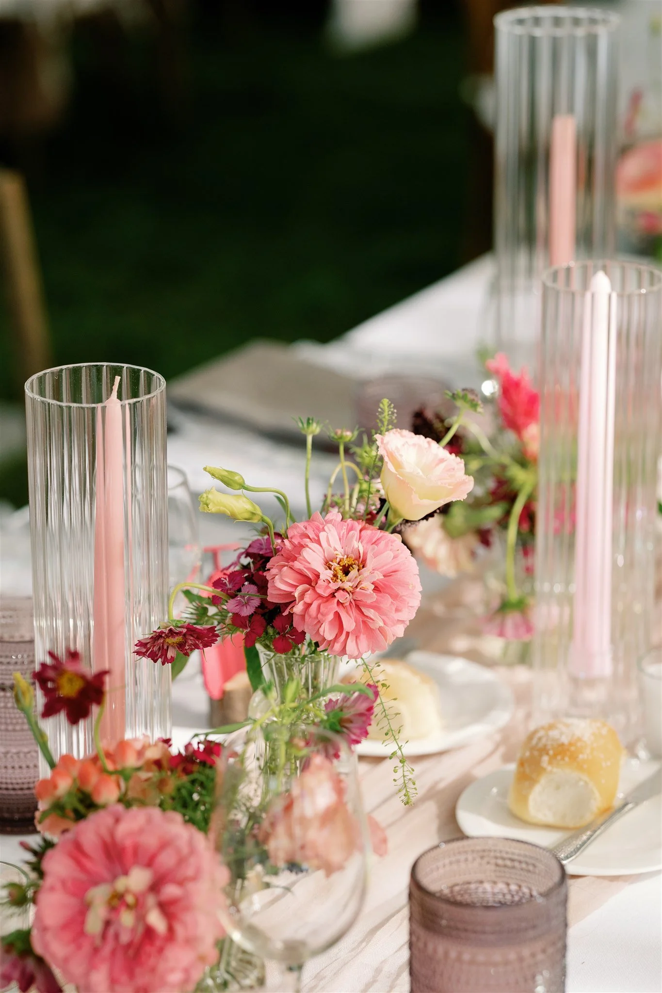
One Hue, Multiple Tints or Shades: Don’t want to pick multiple colors, or worried about competing and contrasting? They pick one color and play with lighter tints and darker shades of that color. One of our 2025 couples wanted a pink color scheme, and by mixing in light and dark pink accents, the resulting tablescapes were a feast for the eyes. We also played with textures, mixing cloth, glass, and wood to give visual interest. Darker fuchsias, light pinks, and rich raspberries all played off of each other for a gorgeous result.
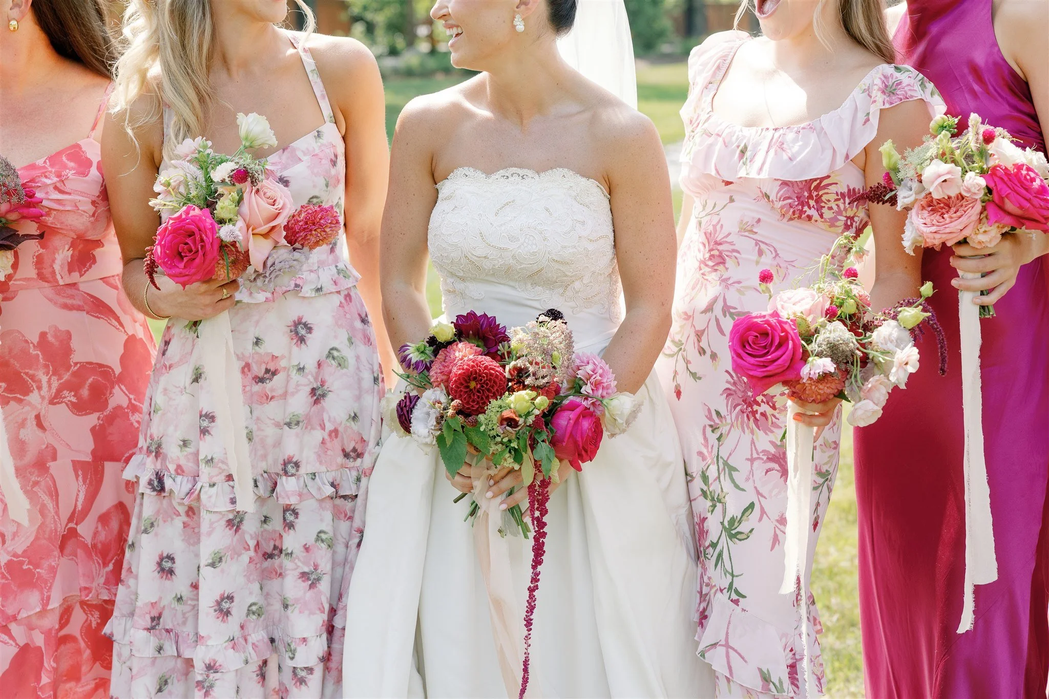
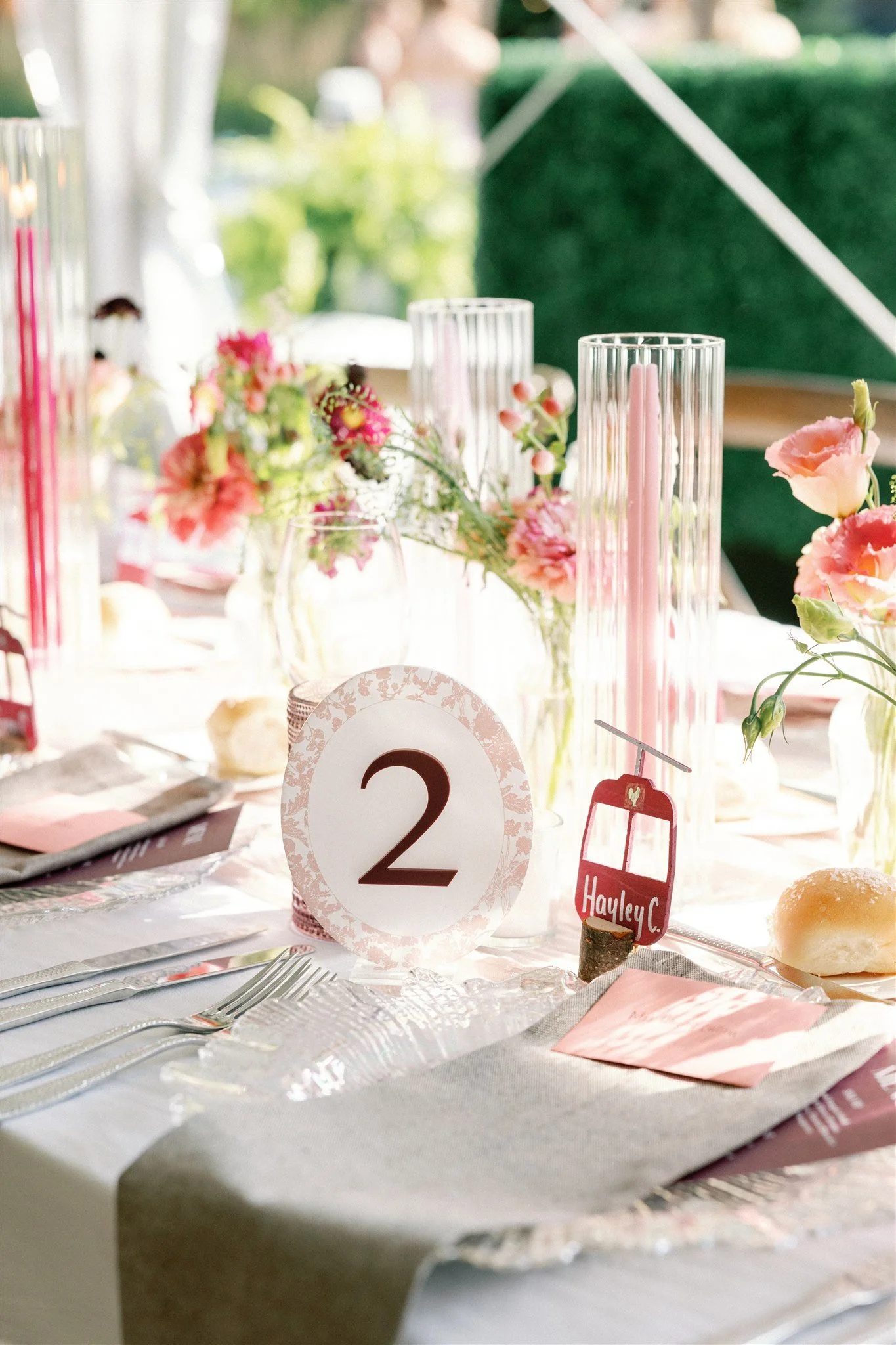
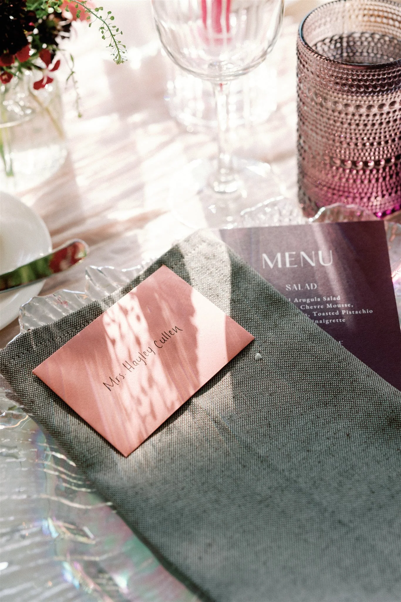
At the end of the day, choose the colors that fit your sense of style, vision, and budget. Color can be pulled into your design in a multitude of ways - through florals, linens, table runners, table decor, outfits and attire, lighting, furniture, candles and votive holders, charger plates, stationary, and even the venue itself. There are so many options; get creative and have fun!